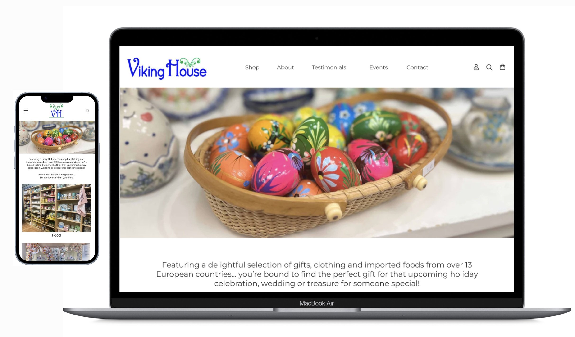
Project: Responsive Web Design
Role: UX Designer | UX Researcher
Time: 65 hours
Viking House is a gift shop specializing in gifts, clothing, food, and jewelry from many Northern European countries. It was founded in 1983. The current website is a Shopify shell that was recently “spruced up” by a local web designer, but there is very little content outside of photographs on the site. They are a much loved store on the main street of the state capital. The goal of this project is to iterate upon a responsive flow for this existing local business. Stakeholders received an MVP (minimum viable product), and the final deliverable - a high-fidelity prototype. It was understood by the client that the final product will be a part of an online portfolio.
How do you learn to paint if you are stuck at home during the Pandemic, live in rural America, or just want to learn in the comfort of your own home?
Discover
The Viking House website is very basic and generated through Shopify, but there is no active catalog of products for sale on the site itself. There is a search function that yields nothing, and a cart that you can’t fill with products. There are only two pages: Home and Contact. It feels like it is missing a lot of pieces that could engage clientele and even provide extra income through shipping. There are some beautiful store images on the site, but they are extremely large, take up the entire page width, and don’t link to anything. There is a call to action to joining their mailing list, but it’s buried at the bottom of the images. The footer is mostly centered and takes up a large amount of real estate.
Competitive Analysis
Research on competitors was very revealing. First, the Viking House is a very unique store, having items from 13 different European countries. Other online shops with brick and mortar stores focused on one particular country, but the premise was the same: European goods sold to curious Americans.
User Interviews
Because this is a redesign of an existing website, I recruited participants to see how they interacted with the current site to find their pain points and qualitative feedback.
Participants
5 Participants
2 male, 2 female, 1 non-binary
Ages: 16, 17, 36, 44, & 49
Research Goal
Understand user preferences, behaviors, and challenges when using the Viking House website when searching for and purchasing artisan and imported European products as gifts for themselves or others. .
Objectives:
Determine if the user can easily use the website
Determine how users interact with the website
Determine preferences and pain points in navigating the site
Discover what users look for when shopping for artisan gifts online
Methodology
These user interviews were done virtually and in-person. Participants who chose the virtual option were provided with a link in the Fathom App. Participants who chose the in-person option were provided with a laptop and necessary tools. The session was recorded in both instances.
Each user was surprised by the fact they could not do anything on the site but scroll and sign up for the newsletter. The catalog was empty, so nothing could be put into a cart, and photographs were all quite large and took up a lot of space on the page.
“Looks pretty but nothing going on.”
“Photos are pretty but overwhelming.”
Affinity Map
Analyze
Affinity mapping trends
Search Functionality - Users wanted the option to filter search by country or category
Item Recommendations - Users wanted to see items recommended to buy based on previous search or item shown
Smaller Photographs - Users felt the photographs should be smaller and more specific of items and categories.
Clickable Country Links - A bar at the top of the page lists the countries and looks like a navigation bar, but none of the words are links. Each user wanted them to be clickable and take you to a country-specific page
Personas
Considering the interview data and unique users along with the trends apparent from the affinity map, I developed two personas to help guide the design of the new responsive website.
Problem
The Viking House is a brick and mortar specialty shop on Main Street in Concord, NH that imports European goods. The Viking House website is a Shopify shell with no items in its catalog and minimal information about the store. Users are struggling to scroll through the large images to find information on the shop and items that it sells. Users were frustrated by the unresponsive search function and a list of countries at the top of the homepage that did not link to products from those countries. In summary, users are struggling to use the website to find information or buy products and end up looking elsewhere for similar items online.
Summary of Key Findings
Four out of five users start their search on Amazon when looking for online gifts. Three out of five mentioned Etsy as an option for finding artisan gifts.
Three of the five suggested going to an in person shop for gift searches such as a bookstore or local boutique.
Recommendations based on previous shopping experiences.
Similar item on sale recommendation
Recommendation that a different item would go well with one looking at.
A filter to put limits on a search for items.
Marketing in store for website with maybe an incentive to go to the website and a QR code in store to get website and store information on your phone.
Sticky navigation bar so you don’t have to scroll so much.
Hours at top and not in the footer
Stronger who we are section.
Clickable country links
Large photos should be sectioned into cards for each general section with over titles
Photos of specific items and not large open rooms full of stuff.
Ability to zoom in on labels on food items and dimensions for larger pieces.
Social media CTA to visit website for more traffic.
Project Goals
I used a Venn diagram to display the project goals in a succint and visual way, considering user goals, business goals, and technical constraints.
Feature Set
Based on my user research conclusions, the project goals, persona, and the competitive analysis, I developed a set of features for this project that includes:
Must-haves
Nice to haves
Surprising and delightful
Can come later
Design
User Flow
After further analysis of the research, I mapped out a user flow with the personas in mind, translating their needs and goals into steps for the flow. After creating the user flow, I realized that the added feature, despite the fact that it adds significant value to the user, is a simple addition to add.
Low Fidelity Wireframes
Taking the persona’s goals, user flow, and task flow into account, I created the first set of wireframes in both mobile and desktop format to test with my users.
Low Fidelity Usability Testing
I took the wireframes back to my original test group with the following goals:
To test the ease of use of the UI.
To test initial UX with mobile and desktop responsive web design
To obtain open-ended feedback from users
Method
Users were provided a paper prototype and asked to verbalize their their experience moving through each screen.
Tasks
Move through the screens verbalizing how you would go about browsing for a food item, limiting the results by the country of Germany, adding the item to your cart, and checking out.
Move through the screens verbalizing how you would go about browsing by country, limiting the results by the country of Germany, adding an item to your cart, and checking out.
Summary of Findings
In general, all users successfully completed the tasks.
Add a Paypal and Venmo option to the checkout.
Remove the explore the store button from the hero image.
Consider changing the flow when adding an item to the cart, so that they can continue shopping and not have to exit the cart screen.
Add an overlay for seeing similar items once it has been added to the cart.
Change the cards on the front page to have text underneath and not overtop of the images.
High Fidelity Wire Frames
The feedback from the initial usability testing provided a lot to consider for the high fidelity wire frames.
Prioritizations
Add a Paypal and Venmo option to the checkout
Remove the explore the store button from the hero image
Change the flow when adding an item to the cart, so that they can continue shopping and not have to exit the cart screen.
Change the cards on the front page to have text underneath and not overtop of the images.
High Fidelity Usability Testing
Research Objectives
Determine if the user can easily move through the desktop and mobile wireframes.
Determine if the user can successfully complete two tasks in both the mobile and desktop wireframes.
Collect qualitative feedback on functionality, layout, and overall user experience.
Establish any pain points
Methodology
This usability testing was done entirely in-person. Participants were provided with an iPhone and laptop to view the prototypes. The sessions were recorded with permission.
Tasks
Move through the screens verbalizing how you would go about browsing for a kitchen & home decor item, limiting the results by the country of Germany, adding the item to your cart, and checking out.
Move through the screens verbalizing how you would go about browsing by country, limiting the results by the country of Germany, finding a kitchen and home decor item, adding it to your cart, and checking out.
Metrics
Task completion rate
Task duration
Number of errors
Qualitative feedback from participants about their experience
Summary of Findings
Metrics
Task completion rate on both formats - 100%
Task duration average - Mobile: 42 seconds / Desktop: 45 seconds
Number of errors - 0
Qualitative feedback:
In general, all users successfully completed the tasks .
Participants liked the clean look and found it straightforward.
Several participants noted that it would be nice to have a saved information option to quicken the checkout process.
One participant commented on adding user reviews under the product information to take up some of the white space.
One participant suggested local store pick-up as an option instead of paying for shipping.
Next Steps
Complete iterations on the prototype:
Add option to save payment
Add pick-up at store option along with shipping
Mentor suggestion to moderate the loud green color in the footer
Final Prototypes & Concluding Thoughts
The final prototypes reflects a major color change in the footer. I had originally attempted to keep to the branding colors of the business’s existing logo, but the dark green and the blue together was too much, so I lightened the green and kept their signature dark blue for pops of color. It was challenging to create two separate sets of screens for both mobile and desktop versions. Beyond enhancing my skills as a designer in Figma, by biggest takeaway from this project was creating all the cards for this project. I expanded my skills in autolayout and using components which was helpful. I had not made the footers a component, so when I went to make changes, I had to change each screen. That won’t happen again.
Besides the actual design aspect of creating UI, which is a lot of fun, my favorite part of the design process are the interviews. I love how people give feedback that makes me think and work to improve my designs. I love watching them move through the UI and seeing sticking points or pain points that I hadn’t previously considered. No matter how tedious some of the work, I love seeing the process and the final product.


